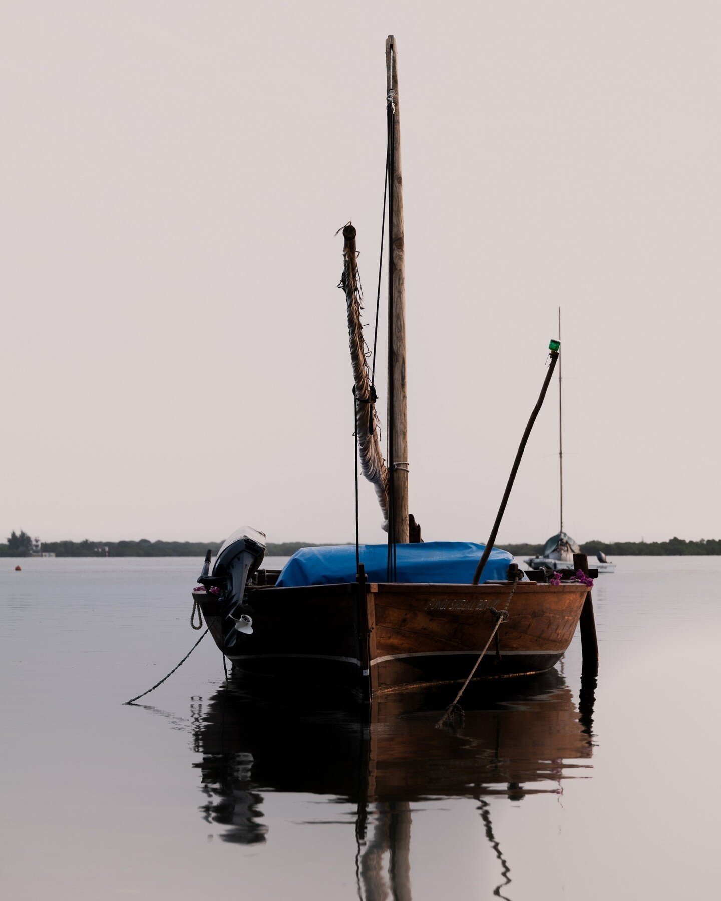
RE SIGN
The project’s theoretical underpinnings are rooted in the evolution of written language and its development from image to abstraction.
The dissertation follows Adrian Frutiger and Wassily Kandinsky’s research to elaborate on the perception of signs and the production of meaning. The reader engages with Kandinsky’s theory of forms and Frutiger’s classic studies on the human expression of thought through graphic means.
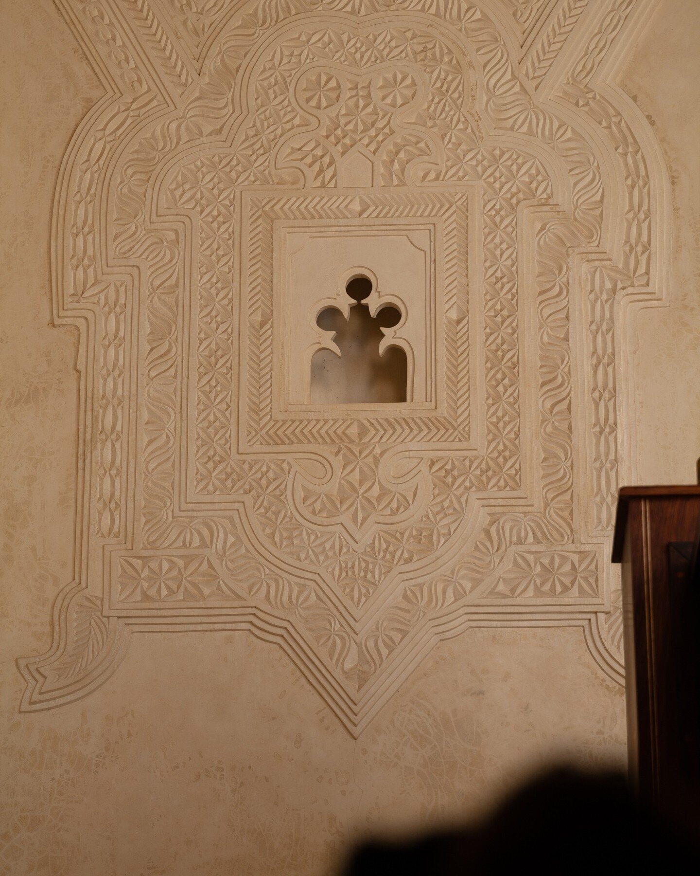
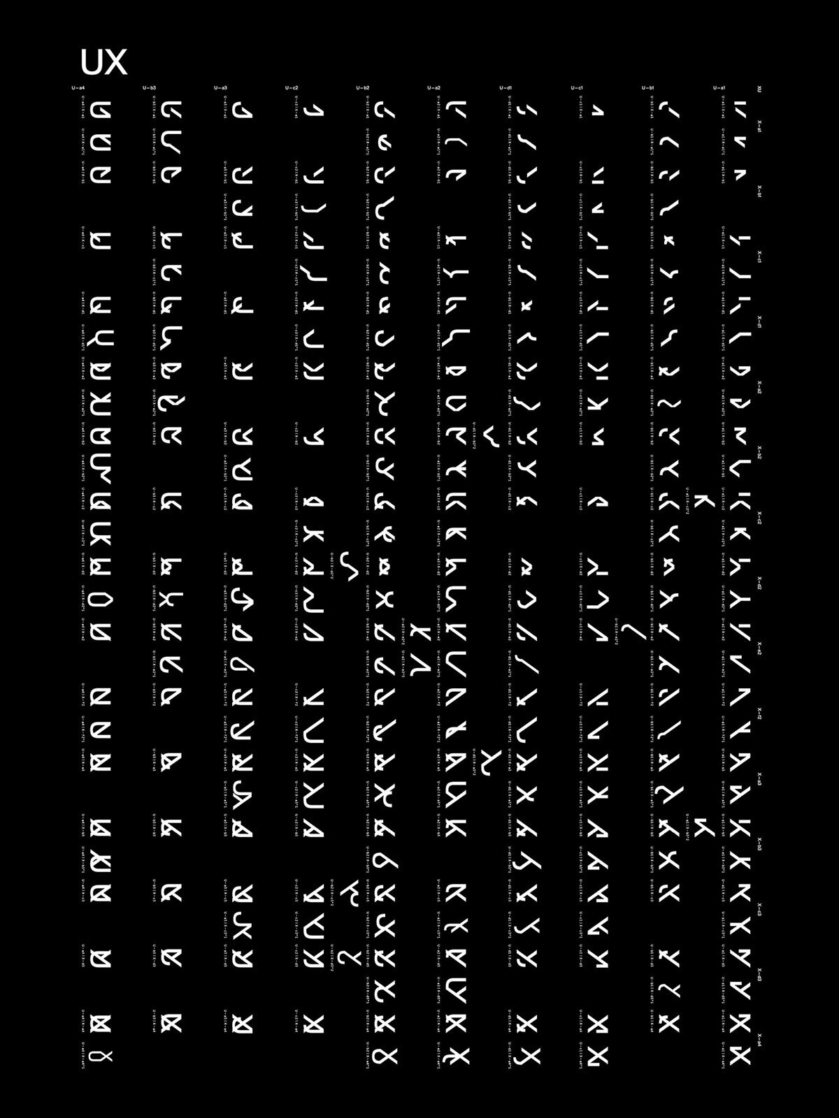
The practical part uses a specific methodology of systematically de- and reconstructing contemporary Latin letter shapes. This process is built around the logic of the Punnett Square, a diagram used by geneticists to determine the probability of an offspring having a particular genotype as the outcome of a specific cross or breeding experiment.
The result is an extensive library of scientifically engineered typographic forms, questioning our perception of written language. The shapes fluidly occupy both, the familiar and the unfamiliar, gradually shifting from one to the other – some simplistic, others opulent in visual allure.
The research and visual library took shape in an 800+ page colossal book, which has received the distinguished Certificate of Typographic Excellence by the Type Director’s Club, New York, in 2016 and the Annual Student Award.
It was part of the TDC63 Global Exhibition Tour in the same year and received Best in Show at the 2017 Graduate Exhibition at the Mediadesign Hochschule, Munich.
In 2018 the project was re-exhibited at the Courtyard Gallery, Royal College of Art, as part of the annual exhibition »Typographic Singularity«.


Made it all the way down here?
Check out these projects:

Theinhardt — A Typeface Analysis
An award-winning typographic publication analysing a true gem of Swiss type-design by François Rappo ⟶ view project

Kilian Schoen Chocolates
Building a generous and sustainable brand universe for a family owned chocolate company from the heart of Bavaria ⟶ learn more
Have a big idea and would like to collaborate?
Please get in touch via info@kevinkremer.design
Visual Diary